

ColourColour Chat: Marsala
Like many designers, colour enthusiasts like me look forward to Pantone’s yearly selection of colours. They’re not the only ones who make seasonal colour predictions but theirs gets the most attention. It’s certainly something to look forward to as many are keen to design in ‘THE’ colour of the year.

For 2015, Pantone chose Marsala; a colour that’s in the family of wine reds. In fact, it is named after the much loved fortified Italian wine which is a key ingredient of popular dishes like Chicken Marsala and desserts like Tiramisu. [Recipes: Tiramisu and Chicken Marsala]
It’s no wonder Pantone describes it in ways that reflect the familiar pleasures of home – a good meal, a warm hearth and precious moments shared with family and friends.[See Here]
I like Marsala because it is familiar and yet sophisticated. It is clearly a great stand-alone colour. It has personality and that sophisticated but understated exuberance that suggests grounded pride and confidence.
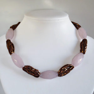
Working Marsala into your outfit may prove more difficult than expected. When the combination isn’t right, Marsala either disappoints or overshadows much else. I guess it’s one of those colours that’s best had in small, striking dashes or strong, well-defined platters. Here’s my selection of workable Marsala Palettes.

With Pinked Grays & Taupe
This is a very safe way to combine Marsala. The dark taupes and beige echo its brown undertone. Though safe, this is still a standout way to wear Marsala.

With Light – Pastel Pinks
Combining pastel pinks with Marsala is an easy hit. This combination works so well because the pinks contrast with and soften Marsala’s strong presence. I think this combination would work well with either Pastel Pinks or Marsala in the dominant role.

With Orange & Coral
Surprisingly, Marsala combines well with intense coral. I think they feed off each other’s warmth, creating a combination which is quite appealing even if it feels jarring at first. The trick to working this palette is to bring mellow orange and peach into the mix. This gives the strong coral a path to softness which then creates a balanced palette.

With Purple
Marsala does combine well with other strong, dark colours. The caveat being that such combinations be made in the right proportions. In this case, I think purples and lilacs are good accent colours for Marsala. They add a cooling touch to the Marsala mix.

With Teal
This is a very nice way to combine Marsala. Even Pantone recommends it. It is certainly very pleasing to the eye. Again, notice how well Marsala works with a strong, contrasting teal. I think this is another combination which is nice with either Marsala or Teal as the dominant colour.
There’s an aesthetic to wearing Marsala. In fashion parlance, the Marsala aesthetic is somewhere between mature sophistication and neo-gothic. A head-to-toe Marsala ensemble could be elegant (imagine a lacy evening gown with matching gemstone earrings) or dark and yet stylish (imagine a Marsala leather bomber jacket worn with a pair of burgundy Corduroy pants and wine red knee-high boots).
Extremes aside, Marsala can be versatile. To prove that Marsala can go further than you might think, I’ll end this post with my Polyvore set showing Marsala combined beautifully with royal blue and bright turquoise. With Oxblood and Burgundy (close relations of Marsala) featuring strongly across the spectrum of fashion goods, I think we’ll be talking about Marsala in one way or another for a while to come.


Follow HMJS♥
![]()
Sorry, the comment form is closed at this time.